 |
| Perfect for those tree-house crows nests! |
 |
|
| Perfect for those tree-house crows nests! |
|
 |
| © Peter Gander 2012 |


 |
| details |
 |
| Whitstable icons print © Peter Gander |
    |
| 1st (rough) visual for kids’ tee shirt with detail shots © Peter Gander 2012 |

 |
| My mock-up of the design in-situ |
 |
| The original 19th C High Street, Canterbury entrance to The Beaney. |
 |
| So now you know! © Peter Gander (after Chaucer!) |
 |
| Details from the artwork © Peter Gander 2012 |
 | ||||
| The new bit of The Beaney to the rear, (the artwork would appear bottom left, full width of the stairs) |
 | ||||||||
| My rough sketch indicating the final idea - ‘The A to Z of the B and C’ © Peter Gander 2012 |
| Canterbury City Council (CCC) recently asked local artists to submit their ideas for an artwork to coincide with The Beaney’s re-opening after redevelopment. The Beaney (formerly The Beaney Institute) is a museum, art gallery and community library/cultural centre. The winning artists’ work will appear in the new wing which has been developed to the rear of the main 19th century building’s entrance. Occupying a lovely airy space above the entrance stairs, it measures 1.5m x 10m so it’s a great opportunity and one I particularly relish as I went to art college in Canterbury and it would be a fabulous opportunity and honour to have my work exhibited in such a great venue as The Beaney so I wait with bated breath for the council’s decision. THE IDEA The concept is that whilst the area is huge and people are just arriving, leaving or looking across form the nearby mezzanine and perhaps can’t take the whole thing in at once, they can take a bite-sized fact away with them. This sits in line with the spirit of the place in imparting information in an interesting fashion. ‘The A to Z of the B and C’ provides an amusing alphabet of Beaney and Canterbury (the ‘B & C’ bit) tidbits such as the connection between ‘Canter’ and ‘Canterbury’ in a palatable way. I chose the new Beaney identity’s purple colour to add a simple two colour effect to the drawings, with a tint of the same, ensuring the piece wasn’t visually busy. A simple papercut-style floral trail snakes through the work, adding a ‘journey-like’ element to the work. I didn’t address every letter of the alphabet, it was merely a sketchy indicaton of my main idea, the intention being, should I win the work, that I will work alongside The Beaney to complete the piece. It will be reproduced digitally and exhibited on a large roller-blind-like ‘canvas’. The whole thing will be hand-drawn, of course. And hand-lettered. |
 |
| The Festival celebrates its 20th anniversary this year |
 |
| The full picture |
 |
| The client’s shop |
 |
| A local and not-so-local vintage |
 |
| Toby |
 |
| Traditional Indian motif |
 |
| Close-up of the weave and tea plant flower |
 |
| Australia map |
 |
| Polo player |
 |
| Pooh bear |
|
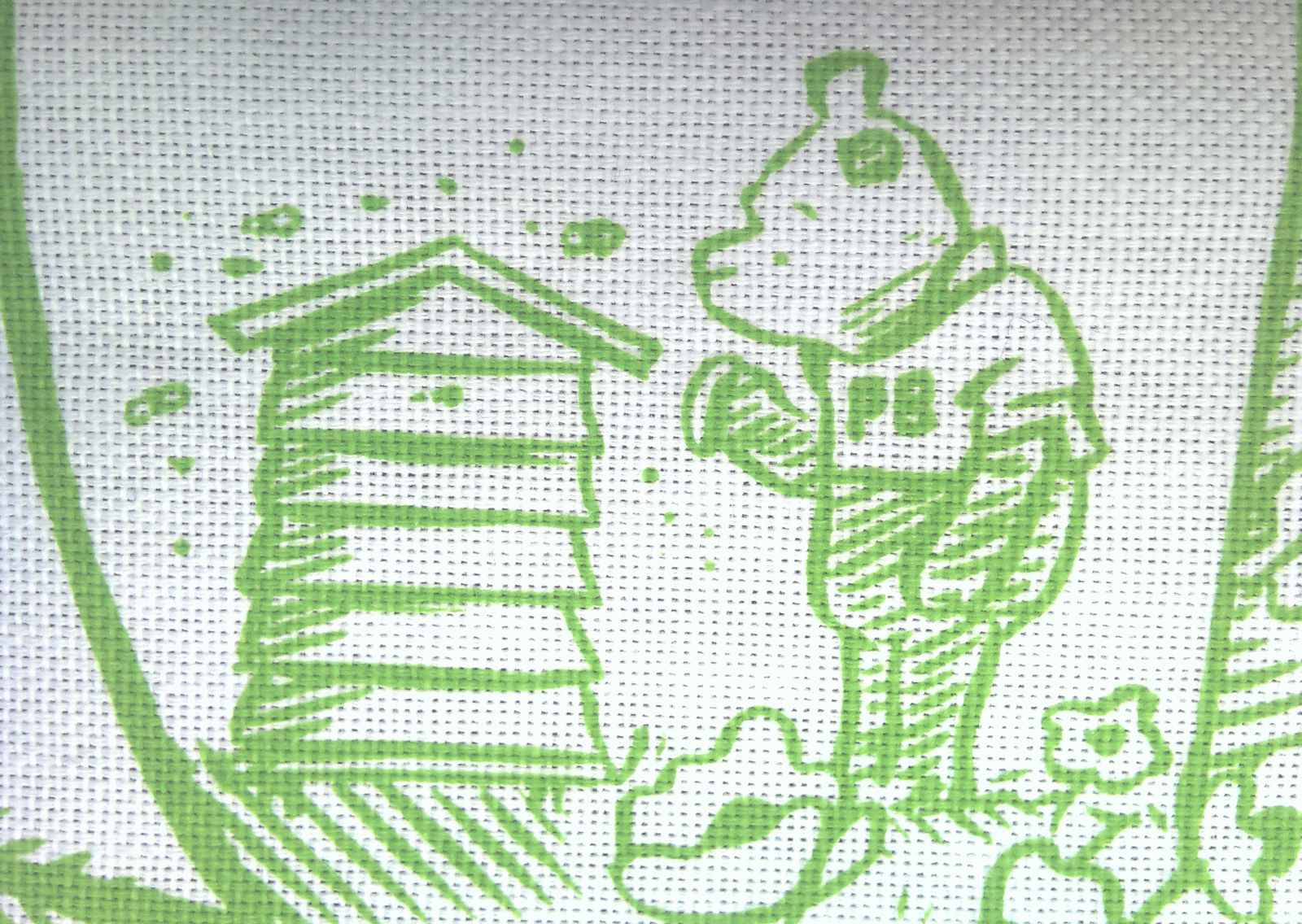
| Tracy’s tailormade tea towel printed in a verdant green © Peter Gander 2012 |
Hand-drawn in brush pen with digital colour. © Peter Gander


