Tuesday, December 28, 2010

Muttley

Muttley © Peter Gander
Like buses, no paintings of dogs for years, then three come along at once ;) This one I did for Liz, a Christmas gift as it were, from my wife Fiona. Mutley’s a cross between a Lakeland Terrier and a Jack Russell, he’s down from Suffolk to stay for the night with us, so Stanley (our dog) will have company. They have already fought a few times, but now I think Stan understands that though this dog may be smaller, he is older, so he rules, even in Stan’s own house. That’s how the dog thing works. Anyway, from an artistic viewpoint, I worked from a photo but was very happy with the way that the sunlight effect came across with this uncompromising medium (watercolour). A very dry brush loaded subtly with Payne’s Grey dragged across the textured tooth of the paper assured a lovey texture, perfect for a rough-haired dog such as Muttley. You can see the texture of the paper in the upper green area where the (Winsor & Newton) paint pigment sinks into the pitted parts of the paper, becoming darker in those areas. The effect is lovely, a case of the painting partially at least, ‘painting itself’!

Monday, December 27, 2010

Stanley, Bishopstone Beach, Kent

Stanley, Bishopstone Beach, Kent © Peter Gander
Still on the subject of canines, a recent watercolour of our one year old Parson Russell Terrier, Stanley, wet from splashing through a low tide at nearby Bishopstone cliffs. (Parson Russell Terriers are similar to the Jack Russell, but with longer legs). I painted this as a creative Christmas present to my wife Fiona, very pleased that it’s a good likeness too, down to his ginger eyebrows. He is normally a scruffy-looking dog at the best of times as he’s a rough-haired variety, but the waterlogged coat only adds to that ragged charm. I used masking fluid at the edges of his body to acheive the spiky fur effect on a darker background. Watercolour on Langton Torchon 300gsm paper.

Thursday, December 09, 2010

Border Collie Bobby drawing

Bobby © Peter Gander
Pencil drawing of a friend’s border collie ‘Bobby’. 5B graphite pencil on off-white cartridge paper.

Friday, November 05, 2010

France: Pork joint and French beer

French beer & glass © Peter Gander
We bought some pork belly from the butchers next door to my brother’s house. With some dexterity and a little artfulness, he swiftly took out the ribs from this joint, attached a sliver of fat around the base and wrapped it up snugly with string. Fiona was to cook it later, along with the previous vegetables painted on the previous post. What better to slake your thirst whilst painting than a chilled bottle of French beer too, (although I begrudged having to ‘wait for myself’ to paint it before I could finish it off!
Pork Joint, Navarrenx, France © Peter Gander

Thursday, November 04, 2010

France, leek

Leek © Peter Gander
Still on the side vegetables that went with our roasted pork, a French leek which was later made into a gratin.

France, Autumn marrow

Forgive me for I have not posted lately.  Fiona and I returned to the south of France to Navarrenx where my brother lives, for his 50th birthday. Normally fishing would be high on the agenda, but sadly it was out of season. The local river Oloron is a salmon river and protected at this time of year so we couldn’t even fish for barbel or chub, not even tiddlers, (so I couldn’t live there, that’s not enough scope for fishing!) Thus I got out my filbert brush rather than my fishing rod and did some painting when we weren’t eating or sipping beers in the local bar.
Autumn marrow © Peter Gander
It wasn’t terribly great weather for painting those lights and darks as it was grey and overcast all day as you can see from the overall tone of the painting with just a feint highlight on the marrow’s surface. It had been raining and this was painted in the rural garden of my brother’s gate house, The Concierge that he and his wife Lindy let out to holidaymakers. It lies about 20mins walk from their home in Navarrenx. I painted under a roof overhanging a patio area to the soft drip, drip of the rain falling off the leaves. A blackbird was rustling through fallen leaves in the garden, apart from that, it was wonderfully quiet. We later ate the marrow with Fiona’s roasted pork, the skin was as hard as nails to peel off but it tasted great.

Tuesday, October 19, 2010

Brown trout

Brown trout © Peter Gander
It always comes back to fishing and I’ve had woeful absence of that lately, so if you can’t fish for them, catch them on paper instead, I say. The wonderfully textured surface of The Langton Prestige Mould Made paper (300gsm) is used to good effect on the lower parts of the fish’s body with a dryish brush. Drawn with a 5B pencil.

Thursday, October 14, 2010

Portrait: Nikki

Nikki © Peter Gander
Nikki at work has a very dramatic short and wavy hairstyle which motivated me to paint her. Her very dark hair is also a great contrast to her pale complexion. Painted from a reference pic taken back in the summer, the strong sun from a window added to the stark contrasts. In fact, I left the skin tone as the near-white of the Langton paper to emphasise and simplify things. Using the brush with a dryish mix of pigment for her hair lends a textural effect to the highlights, otherwise the hair becomes just a dark puddle of colour. Watercolour (Winsor & Newton) on Langton Prestige Mould-made 300gsm ‘Grain Torchon’ (rough) paper.

Wednesday, October 13, 2010

Old Man’s Head, British Museum

Old Man’s Head, (possibly the poet Hesiod), British Museum © Peter Gander
’Tis the season to be sketching indoors a bit more now, especially on a dull day like today so back I went to a favourite Rainy Day haunt, The British Museum. I’m lucky enough to work only ten minutes walk away from this free-to-enter Aladdin’s cave of drawing subjects. Though the museum does lend out free stools for sketching/studying purposes, I did this sketch from a standing position. Using a Daler-Rowney Murano Pastel Pad (Neutral colours) and both a Sanguine Oil pencil and Soft White Sketching pencil, I drew this ‘Marble head of an old man, possibly the post Hesiod’ according to the plaque. Like my recent post, Ship in a bottle, the speckled, stony texture of the pastel paper works especially well for studies like this, adding much character. © Peter Gander

Tuesday, October 12, 2010

The Mall Galleries

The Mall Galleries © Peter Gander
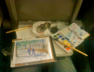
The set-up for painting on the train  © Peter Gander
Yesterday I walked down to The Mall Galleries in The Mall, near Trafalgar Square. The gallery was showing The Royal Society of Miniature Painters, Sculptors & Engravers exhibition. Outside a warm sun was shining strongly, dappling through the plane trees the whole length of The Mall, opposite St James’ Park, reminding me of the avenues of France. (The London plane trees nearby in the south east corner of the park date back to the 1820s). Viewing the gallery and a 15 minute walk each way wasn't going to allow me the time to do any painting myself, so I did a quick pencil sketch, took a colour reference pic on my mobile (for colour ref) and actually painted this from scratch on the train (yes, the train) on the way home! I wouldn't recommend it and it only really works if the jogging of the train doesn't hamper your style (it wouldn't work if you like to paint ruler-straight lines - but my style is loose and impressionistic). I am no fan of having a hundred brushes to hand and there is no room for such luxuries when you only have a foot square drop-down train table to work on. Brush-wise, I used a Pro Arte Renaissance Squirrel size 2 mop, which holds a lot of water for the washes, yet has a fine tip too for the smaller areas. Also in the pic is an unused filbert travel brush (in gold). Plus my tiny Winsor & Newton Pocket Plus watercolour palette, at 12 half-pans and only 13cm x 7cm when stowed, it's ideal for such cramped conditions. (Note the well-designed clip-on palette extension which gives extra space for colour mixing). Not forgetting a couple of water wells (one with  a screw-top) decanted from an old plastic milk carton, a piece of wax candle (for those interesting wax-resist effects) and some tissue complete the equipment list. The watercolour paper was clipped to a pad for resting on, useful for angling purposes as the train table is too much of a right angle. Hopefully this shows you what is possible in confined spaces and makes good use of commuting time. Oh, and expect a few strange looks on the train! Watercolour on 150gsm paper, 178mm w x 127mm h. FOR SALE £50 inc P&P UK mainland only, email me with enquiries: petergander(at)gmail.com

Friday, October 08, 2010

Tower Bridge from Cannon Street station

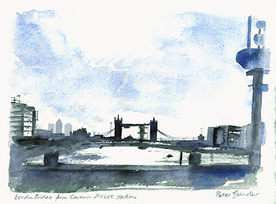
Tower Bridge from Cannon Street station © Peter Gander
I often travel into Cannon Street in the mornings and the sun at this time of day is just coming up over The Thames from the east behind Tower Bridge, silhouetting it against a vapour trail-scarred sky. Much detail is rendered into simple shapes or silhouettes in this contre jour (against the sun) view and the sparkling water looks like a painter's dream. The rail signals of Cannon Street station are seen on the right. This is about as far as you can walk up the end of the platform to get such a fine view as it's purely a railway, not a pedestrian, bridge. Canary Wharf tower is visible in the background. This was painted with only Payne's Grey and Ultramarine and the heavyweight, pulpy Khadi paper on which it's painted allows for plenty of time for those lovely mixes of pigment to infuse into each other, as it stays wet for a good length of time. It virtually paints itself! Sparingly loading the brush (a Kolinsky blue squirrel mop) with dry pigment  and dragging the side of it across the paper gives the effect of sparkling water on the Thames as the tooth of the paper picks up the paint in a textured manner. Watercolour on 210gsm rough Indian Khadi paper. 24cm wide x 18cm high. • FOR SALE £75 email petergander@gmail.com with enquiries, first come, first served. UK mainland only, free postage. Non-UK £100 inc postage.

Thursday, October 07, 2010

Mermaid fountain, Trafalgar Square, London

Trafalgar Square Fountain © Peter Gander
Returning from The Mall Galleries in my lunch hour the other day where I saw and met Yorkshire artist Ashley Jackson at his ‘Power and the Passion’ exhibition, I emerged short of sketching time. I had only a quarter of an hour or so to sketch and returned to one of my favourite drawing subjects, the fountains at Trafalgar Square. This particular mermaid fountain is by Sir Charles Thomas Wheeler (1892-1974). There are two like this in Trafalgar Square dating from between the World Wars. The other one is by a different sculptor and features mermen. There is something about these verdigris-coloured figures and their mystical nature that reminds me of the Ray Harryhausen films I watched when I was young in the 70s where such mythical creatures came to life, like Medusa, harpies and cyclops. Fantastic stuff! The tiny sharks visible here skim the scales of the mermaid in such a skilful way and the sculpture reveals new surprises from whichever angle you view the piece. Quite an achievement. I hope to produce a 'fully-fledged' painting of this fountain, people, National Gallery background et al at a later date, it's such a rich view. 5B carbon pencil (the ones without the wooden surround) and watercolour on heavyweight cartridge pad.

Friday, October 01, 2010

Pret delivery man

100101 Pret delivery man © Peter Gander 
Prets (Pret a Manger) Oxford Street, London, was my port of call for lunch today (Malaysian chicken soup was fabulous). Too wet outside today for ‘live’ sketching, so this is drawn from an old reference photo back at work in one of our teeny meeting rooms as the rain lashed the windows. Never traced of course, (that would be the sure death of the drawing), but stuck on a wall and drawn by eye, as if from life. That way a spontaneity is retained and the artist’s flair or character comes through in the style of drawing. Though it is really way too thin to take watercolour (at 160gsm), I used a pastel paper, Daler Rowney Murano (Neutral colours) Pastel Pad, as I liked the appropriate stony base colour for the stone-flagged streets of London. The white areas are Conté pencil and the key of the paper is visible in those areas. The Conté adds a lovely pastel-like chalkiness. Carbon pencil and watercolour on Daler-Rowney Murano Pastel Paper.

Sunday, September 26, 2010

Chimney pot seagull • SOLD

Chimney pot seagull SOLD © Peter Gander
I’ve been itching to upload this 3rd painting in a series of seagull paintings. This particular one was commissioned by a previous painting customer in Whitstable who employed me to paint a picture of his house. His wife was particularly fond of the imperious expression I had captured in a previous gull painting, so I hope I maintained that here. She also requested a Victorian chimney pot. I did try alternative viewpoints, but this particular low angle was really the only way to convey that proud attitude! Watercolour and 5B pencil on Langton ‘grain fin’ 300gsm paper.

Tuesday, September 21, 2010

Ship in a bottle, Trafalgar Square, London

Ship in a bottle, Trafalgar Square © Peter Gander
Trafalgar Square is a walkable 20 minutes from my office in Tottenham Court Road, so I ambled down there the other day, on a balmy September lunchtime. The line drawing (Pentel NMF50, Superfine point) was done in-situ and I took a photo for colour reference to refer to later as it was not possible to both draw and paint the scene in the 20 mins I had before getting back. The Fourth Plinth has been set aside for contemporary pieces of art, though it was once destined to support a rider on horseback which hasn’t yet transpired. The Ship in a bottle is by artist Yinka Shonibare and celebrates the maritime history of the battle of Trafalgar - see http://www.london.gov.uk/trafalgarsquare/around/4th_plinth.jsp for details. The painting was applied to Daler-Rowney Pastel Paper, a little too thin (160gsm) for watercolour really, as it buckles, but the tinted colour, an oatmeal and the addition of white Conté pencil for the highlights made better use of this paper. It has a nice vertical grain and the overall texture lends itslef nicely to the mainly stone subject matter. Watercolour on Daler-Rowney Murano Neutral Pastel Paper with white Conté pencil.

Thursday, September 16, 2010

Red phone box, Piccadilly

Red phone box, Piccadilly © Peter Gander
A painting of scaffolding-strewn Piccadilly near The Royal Academy, London. Once seen on every street corner in the land, the lesser-spotted red phone box now only appears occasionally in select sites, like the prettiest village green or by an iconic London landmark. It has long been replaced by matt black versions (awful) or even worse, the modern BT kiosk. I hear the decommissioned boxes shown have been made into personal showers, etc and I have seen one or two in country gardens in my commute to London. The morning light was bright and strong and created a nice burnt-out area on the top of the phone box. A limited palette keeps the piece harmonious. (I used a Winsor & Newton Cotman Pocket Plus half-pan painting box, which has 12 colours). Black Pentel Pen NMF50 (O.5 nib) on Daler Rowney Fine-Grain Heavyweight (200gsm) paper pad.

Monday, September 13, 2010

Spain, poolside sketches

Potted plant © Peter Gander
Candy, the neighbour's dog. © Peter Gander
Potted palm © Peter Gander
I recently had to whizz over to Spain to tend to some urgent family business and took along my sketchbook. Here's a few painted by the poolside at Eric and Annes, who kindly put me up. They live near Horadada, Alicante on Spain's east coast (Costa Blanca). Candy the dog proved a tricky subject as she was constantly on the move, so the sketch must have lasted all of 5 minutes. Watercolour & 5B graphite pencil.

Thursday, September 02, 2010

‘Rude Britannia’ Maggie Thatcher sketch

Fiona and I visited Tate Britain today in Pimlico, London for the final few days of the Rude Britannia (love that title) exhibition of comic British art. Comic as in humorous, this was not exclusively paper comic-based stuff, though there was plenty of that in the form of Viz characters. No, there were bawdy Victorian etchings to contemporary sculptures and everything in-between. Artsists included my own personal hero Donald McGill, who was perhaps the most skilful/least crude painter of the golden era of 1950s & 60s saucy seaside postcards (see top right in the image). In the political room, where patrons were encouraged to draw their own caricature, I went over to the Spitting Image figure of our former British Prime Minister (now Lady) Margaret Thatcher, the perhaps infamous Iron Lady who was a prime target of the satirical puppet series from 1984 and another decade after that. Of course, all I had to do was copy the already-caricatured profile - all the hard work had been done by Peter Fluck and Roger Law. Anyway, it was still a pleasure to do another in-situ sketch. If anyone’s in London until Sunday 5th September 2010, go and see it!

Tuesday, August 31, 2010

Street people (SOLD)

‘Street People’ mixed media © Peter Gander SOLD
Painted just a few days before the show and already sold (thank you to Simon Golding ;). For a change I used gouache in addition to watercolour to get those fiddly bits of (especially) light colour down on top of a watercolour base. (The alternative being to save the areas in white by using masking fluid, then watercolour). ‘The Street’, as you may know from previous posts, is a shingle spit in Whitstable that is exposed at low tide and is a popular spot for walkers, thus the ‘Street people’ title. I’ve even caught a bass when fly-fishing here after spotting some gulls swooping down over the feature. It was fun, if time-consuming, painting this, as people are obviously detail-rich, but I will be doing some more like this at a later date. Watercolour and gouache on Langton 300gsm rough watercolour paper.

Thursday, August 26, 2010

Original painted postcards - seascapes

Low tide tracks © Peter Gander FOR SALE
During my recent art exhibition at The Horsebridge in Whitstable, to save me going quietly mad during the less busy spells (okay, and to look like a proper artist), I painted some tiny originals to sell. In the end I painted nearly twenty of them over a few days and here are a couple of favourites.
Early start © Peter Gander FOR SALE
This one exploits the rough surface with a dryish brush. I use a huge size 20 squirrel mop, useful for overing a large area quickly. 
Pebble path © Peter Gander FOR SALE

Wednesday, August 25, 2010

Linocut sketch: Navarrenx salmon poster/postcard

© Peter Gander
My brother David lives with his wife Lindy and daughter Nancy in a fortified medieval town called Navarrenx in the Béarn region of south-west France, close to the foothills of the Pyrenees. Navarrenx was the first fortified town to be built in France (in 1316) and reminds me of Canterbury near my home in Kent, as it has a wall and ramparts surrounding it and, like Canterbury, you cannot walk around the town without being aware that the place is steeped in history. A minute’s walk from my brother's front door is the ‘Gave d’Oloron’, a picturesque salmon river that I have fished myself - not for salmon as yet, but I have caught rainbow trout here, cooked on a riverside barbecue minutes after being caught! David and Lindy run Galerie Le Petit Chien and I have threatened to produce some Navarrenx-themed artwork many times before, so this morning I finally got down to sketching out this poster/postcard design en route to London on the train. By the way, any similarity to the golden age of travel poster design is purely intentional - I do love the retro feel that it has ;) The bridge is drawn from memory and I have since checked my pics of the bridge and it doesn’t have as many arches, so I will need to address that, but generally I am very content with the design. Fiona suggests I make the happy angler look in the direction of his quarry too, which is a fair point, as the two elements are a little disconnected. This will be a two-colour linocut, in black and a blue-grey and will be a tad smaller than A3 size. I will make handmade limited edition prints of this and I will also scan and produce postcards from these prints for their gallery too. Permanent pen and graphite pencil (grey areas) on parchment sketchbook. © Peter Gander

Tuesday, August 24, 2010

Piquillo

A piquillo poses. © Peter Gander
The last of my ‘piquillos’ sits in a plastic tub shielded from my cutting mat by a napkin. Bought from the deli round the corner from the gallery where I’ve stewarded for the last couple of days. Piquillos are a favourite basque tapas dish. Quite fiery are these innocent-looking peppers (more like a chilli pepper) which are stuffed with all sorts of things but in my experience, usually a creamy cheese. My brother lives in the basque town of Navarrenx in south-western France, so I am happy to report that I’ve come across these delights before. The heat of the chargrilled pepper is offset by the smooth, rich cheese. Note how the oil has taken on the hue of the mini red pepper. I can’t recommend them enough! Watercolour on Langton rough 300gsm paper.

Friday, August 20, 2010

Mini linocuts, framed

© Peter Gander FOR SALE
For my current show, I produced this cute little trio of linocuts, A Whitstable Oyster Yawl; Whitstable Seagull and the familiar-by-now Whitstable Fish Market Fisherman. They were hand-printed onto watercolour paper with a waterbased ink in a black-to-blue blend. They are edition numbered, signed and framed in a white box-style frame.

Thursday, August 19, 2010

Boat by The Street, Whitstable

© Peter Gander • SOLD (2010)
Just east of the harbour on Whitstable's shore is a long shingle spit that, at low tide, extends a kilometre northwards out to sea. It has been nicknamed 'The Street' as it is a popular walking spot. Just visible on the horizon are the Maunsell forts. See previous post for images and info on these wartime relics.

Friday, August 13, 2010

'Local mackerel' linocut, the final print

© Peter Gander Limited Edition linocut FOR SALE
So, in conclusion, though the idea of a Japanese paper really appealed (it even had wispy, sun-on-the-sea-style highlights in it), I had to abandon the idea once I saw that the fibres made the ink spread in a bad way. Thus I used a heavy watercolour paper in the end, which was ideal in the end as I hand-coloured the back of the mackerel with a metallic turquoise glittery paint to add an extra dimension. (The weekend's photo will hopefully do more justice to that). Using an oil-based ink these days is not so popular due to the hassle and un-eco-friendly nature of the cleaning products, but in this case it was necessary to print then colour afterwards with watercolour. Something that you can't do obviously with water-based inks, as they will then run once you add further colour, post-printing, by hand. Oil-based printing ink with watercolour and metallic glitter paint on 250gsm smooth watercolour paper.

'Local mackerel' linocut, inking to printing...

Using a heavy-duty craft (Stanley) knife to get rid of excess lino
All off, then I bevelled the outer edge of the fish to avoid it catching any ink
This Japanese 'Yuki' paper was intended to be used, however it was too fibrous/furry and didn't take ink well. In the end I used watercolour paper, which was just as well as I added some hand-colouring which the thin Yuki wouldn't be fit for.
Taking a rubbing with a graphite/lead pencil, 'brass-rubbing-style', is a great way to foresee how the print will come out, like a dry proofing. Albeit the wrong way round, it will let you know if there's any lines not quite working.
The complete rubbing.
I was keen to produce a vertical gradated colour effect with black on the fishes back to ultramrarine blue at its belly. The ink is then picked up on the roller where the gradation becomes more fluid as the roller goes back and forth. So the roller was used vertically here. The trick is to span the gradation only within the height that you need. Mixing/thinning the ink at this point is very tricky as you can't mess around with the blended inks too much without spoiling the gradation.
The goal is to achieve a fine 'pore' to the ink to get to a good and thin consistency. Listen out for a fine 'hiss' too as the roller runs to and fro, this is a good sign that the ink is ready. At the point that this photo was taken, it is visibly too thick, as seen on the roller.
My roller bed is virtually the same size as my intendeed paper (about 30cm deep), so I stuck (with double-sided tape) the fish down on the same size peper that will be used to print on. A piece of card on the right is stuck on the edge. This will have the 'receiving' paper butted against it to register accurately.
The fish is inked and awaiting a sheet of paper (and a printing felt over that) before the roller does its work.
A ghostly fish is visible through the thin Japanese paper. Felt is laid over this to cushion the printing matrix.
After repeat inkings and prints are made, unless you are, if you are imperfect like me, going to get ink where you don't want it. Simple cover those places up with some masking tape or paper - anything that masks the area as long as it is lower than the lino (otherwise it will also pick up ink, of course).

Thursday, August 12, 2010

'Local mackerel' linocut, final cut marks, work-in-progress...

© Peter Gander
© Peter Gander
I finished the mackerel linocut last night. The lettering was rather tricksy to carve - lots of tight curves at a small size. Note that I've cut away around the outline of the fish. The lino beyond this will be cut away completely with a Stanley (craft) knife to avoid any unwanted areas picking up ink later. Then it will be mounted onto card or wood for stability and ease of registration.

Wednesday, August 11, 2010

'Local mackerel' linocut, first cut marks, work-in-progress...

I carve the lino initially in an outline first, to seperate the whole shape from the background (which will be cut off later and the carving laid out to register on a block). Different tools are used here for different purposes. Not that the finer 'V' tool is used to inscribe the fine ridges of the fish's pectoral fins and a wider 'U' tool ploughs out larger areas that will be white/blank, such as the belly area or outside the outline itself.

'Local mackerel' linocut, tracing down work-in-progress...

Having carefully copying the mackerel design onto tracing paper, it's ready to be flipped back-to-front and transferred onto the lino itself.

Illustration for upcoming 'Lake District Map'

Hand-drawn in brush pen with digital colour.  © Peter Gander