Search Peter's Blog

Showing posts with label print. Show all posts

Tuesday, April 08, 2014

‘You’re a Legend’ Father’s Day A4 print

© Peter Gander 2014

Work-in-progress chalking  © Peter Gander 2014
Again, printed from a hand-drawn chalk original, a new print design for www.haveagander.biz for Father’s Day in June. Out soon. Original: chalk on board.

Wednesday, July 18, 2012

Hand-drawn Whitstable icons print

Whitstable icons print  © Peter Gander
For lovers of ‘The Bubble’, a reminder on the wall of why they keep going back to this lovely north Kent seaside town. Famous for its oysters and Oyster Festival, the Hammer House of Horrors actor Peter Cushing and the brass diving helmet (it was invented here). Whether a beer at ‘The Neppy’ is you bag or a plate of fish and chips on the beach is more your style, there’s sure to be a personal favourite on here. Printed on archival-quality A3 (297mm wide x 420mm high) paper with great lightfastness. Buy one on Folksy Original was painted with brush and black Indian ink, plus marker pens.

Wednesday, June 20, 2012

Artwork for 2012 tea towel

2012 design  © Peter Gander

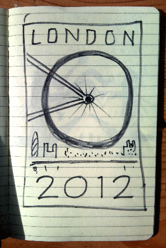
Original notebook sketch
Detail: London couple strolling

Detail: Rasta, texting girl and lost tourist
All of the original linework for this was hand-painted by brush and ink, even the fonts, then scanned and composed with Photoshop. With a characteristic visual twist, this design depicts The London Eye as an Olympian’s rear bicycle wheel and is surrounded by amusing details of a typically varied collection of London spectators. Look out for the lost tourist, the 'proposal couple' and even a wandering gander! (See detail pics). To be printed in 'Union Jack red and blue' and now available as an art print at Folksy and Etsy and soon available as a tea towel (July 2012).

Monday, January 31, 2011

‘Wildlife artist of the Year’ submission 1 of 2: Hippo & calf

Hippo & calf © Peter Gander

The inked hippos await the roller press

The whole background is ready for inking
Adding shellac to prevent ink soak-up
The lino is registered onto a paper template
A pencil rubbing checks the linework (in reverse)
Cutting the image out with a craft knife
Carving the lino (detail)
I have just finished and entered two very different prints for the David Shepherd ‘Wildlife Artist of the Year’ open art competition. Both, however, are combination prints, using the same techniques as the previous post; King Crow. That is, using both Japanese vinyl and cardboard printmaking in the same print. Both use the vinyl for the main images and cardboard for the more textured backgrounds. Hippo & calf utilises the black paper to full effect in that the paper becomes the linework. In other words, the cut lines, rather than the areas conventionally left to print by cutting away all BUT the lines, are revealed by the background paper. So what looks like a 3-colour linoprint (for the hippo itself) is actually a single (graduated) print on black paper. The ink was mixed on the roller in this case. The carboard background was printed seperately, flecks of white paint added by hand too. Every print is unique as each one is coloured up seperately and is effectively a bit of a mixture of collagraph and monoprint. Oil-based inks on 200gsm black card.


Thursday, January 27, 2011

Work-in-progress: The Crow King (vinyl & board print)

Continuing my corvid phase, today I used a lino-like material called Japanese Soft Cut vinyl that I bought online from Intaglio Printmaker.co.uk It’s floppier and shinier and softer than lino, though I think lino still has some way to go to be beaten. The vinyl I found much ‘stickier’ than lino, with the end of the cutting stroke often rebounding or not finishing in a clean manner. However, if you are not planning anything too fine in detail, it’s lovely stuff and very easy to carve.
Carving fine lines is tricky with vinyl
The pencil ‘rubbing’ to check progress
Mixing a two-colour gradation on the roller
Ready to roll. Note the card registration blocks at the top
The first ones drying
Inking the card background
Once my design is carved, I make a ‘lino rubbing’, placing a sheet of thin cartridge paper over the lino/vinyl to check that all is well with the image. Then I cut out the shape with a craft knife (easier to do than with lino) and stick it onto a board to keep it stable for printing and to register it properly. Rather than use a solo black for the crow, which after all, have irridescent feathers, I opted to mix a blue and black gradation on the roller. Then it’s just a case of testing the roller pressure and away I go. I tend to try out different paper colours as artists prints (AP’s) until I find my preferred one. In this case it was a humble brown paper. On to the background. Sometimes the background simply doesn’t warrant the efforts of lino/vinyl cutting or I simply prefer to use a different substrate for its unique texture. As was the case here - I cut out the negative area left by the crow from card, the kind you find on the back of layout and cartridge pads. It’s not as soft or corrugated like cardboard and being made of pulp, reveals interesting textures when inked up, not a dull smoothness. Use shellac or PVA to prevent the inks from seeping too much into the absorbent card though. Once this has dried and the cut-out married up to another board and registered, make the second colour print-run. The main photo reveals the final print, which I am very happy with! Seawhite (of Brighton) waterbased printing inks on (Paperchase) recycled ribbed brown Kraft paper (A4: 297mm w x 210mm h).

Tuesday, January 25, 2011

Crow I (adapted monoprint)

Crow I © Peter Gander
I confess I tried hand-colouring this black-only monoprint but sadly I made a hash of it. Thus with a bit of Photoshop magic, I saved the piece, though now that it has been digitally enhanced, I can sadly no longer say it is a monoprint, of course. But the 1940’s-style colouring looks good. Original: water-based ink on Neutral Daler-Rowney Murano Pastel 160gsm paper.

Sow, board print limited edition 1/10

Sow 1 of 10 board prints © Peter Gander
Following on from yesterday’s painting of the pigs at Snape in Suffolk, I wanted to explore a more gritty texture for the pig and an uncoated board print fits the bill nicely. Board prints (paper/card-based) are ideal for speedy but impressive printmaking. (The small print runs also make them more attractive for collectors). The pig here is cut out jigsaw-style from the background which is also kept for the second colour. The two pieces are then inked up seperately, printing the (pink) pig first ten times then running the printed pig through for the second (background/mud-brown) run. I did try other coloured papers for this, but only a black will reveal important lines, such as her mouth and the shadow under her ear. You have to think in negative values, which is quite tricky as the ‘holes’ become the black areas. You can see why I chose uncoated board for this, as it reveals some great textures you just don’t get with a smooth surface, such as line. The appearance is actually closer to woodgrain than lino. 2-colour oil-based ink on Raven black paper, 1 of a limited edition of 10.

Friday, January 07, 2011

Leaping Salmon

The final two-colour print © Peter Gander

See today’s previous post to see how this was made...

Making the cardboard print for Leaping Salmon

The logo made with cardboard printing
Logo in-situ
After printing a simple oast house logo for my wife Fiona’s blog, ‘Fiona’s Kent Food’, I felt inspired to test the boundaries of printing using paper and card. Unlike the glass-smooth surface of lino, cardboard and paper can have a lovely texture and the fact that it is easily cut offsets the downside that you can’t print more than a few runs from your ‘block’. These are really monoprints, in fact, as no two will be the same. Because Fiona’s end product was a logo for digital reproduction and thus only one was needed, it wasn’t really worth crafting it in lino anyway.
It is the lovely texture of a hand-pulled print that was the important thing. Of course, I could have imitated this printed effect digitally in Photoshop, but where’s purity/fun in that? So, accepting the limitations of paper and card I chose a simple image of  a leaping salmon, as fishing is a subject close to my heart.
The cardboard salmon © Peter Gander
Cornelissen’s Shellac Varnish
This cardboard is taken from the back of one of my drawing pads. It’s quite solid and just thick enough (about 3mm) to be able to cut through easily with a scalpel blade. Also you can see where I’ve debossed and incised areas like the gills and fins with scribing tools. I also used the back end of a paintbrush to dimple the fish’s body and thus create white spots where the ink won’t reach. PG’s TIP If you’re using uncoated paper and card you will need to prevent ink soaking into the substrate, so use Shellac varnish or PVA to coat your relief ‘block’. I use shellac as it dries very quickly. The one shown was purchased at London’s Cornelissen’s art shop. A couple of coats or more may be necessary, but they dry very quickly. So once your image is cut out, you can adhere it to another board for stability, but a small one-off design won’t need it, if you’re going to print it rubber-stamp style. Small surface areas can be sponged or painted with a thin layer of ink or use a roller and sheet of glass to roll out your ink on. If you’re crafty and have a little space between seperate colours or tones, you can easily dab on colour all in one go if you’re quick and can do it before the first colour you put down dries out. As the print is relatively simple, I wanted to make use of some spare fancy Japanese Yuki paper. This handmade paper has threads of silk running through it. It’s not very evident from the main pic, but the detail photo here shows how the threads reflect the light.

Soaking the card with shellac
The Yuki paper
The salmon just before it’s ‘ready to roll’
I cut a window the same size as the baseboard holding the fish, out of a larger piece of paper which was then taped to the bed of my roller press. The larger piece of paper matches the paper size that will be used for printing on. Then I drop the freshly-inked printing block inside the window, lay a piece of paper face down onto that, then keep it in place with the felt blanket. Then it’s a case of adjusting the roller press pressure to suit and get printing!