Search Peter's Blog

Showing posts with label illustration. Show all posts

Monday, September 09, 2013

Inked ‘Cockerel’

The final illustration  © Peter Gander 2013


A new www.haveagander.biz addition to the ‘Menagerie’ series of hand-painted animals which we make into rubber stamps and hand-print onto greetings cards.

Tuesday, May 07, 2013

‘Thank You’ swallow gift tag art

Swallow Thank You’ tag  © Peter Gander 2013
Today I adapted the artwork of our ‘Swallow’ card www.notonthehighstreet.com/haveagander/product/hand-printed-swallow-card to customise it for a ‘Thank You’ gift tag & card. Original: The swallow image and new banner were hand-drawn in black ink with a brush and scratch (dip) pen.


Drawing the new banner with scratch pen  © Peter Gander 2013

© Peter Gander 2013

Tuesday, February 19, 2013

‘Goose’ brush and ink

‘Goose’ brush and ink  © Peter Gander 2013

Card mock-up  © Peter Gander 2013
This is the final number 10 in a series and what more fitting beast for our Have a Gander ‘Menagerie’ range of handprinted cards than a goose? Available on Folksy and Etsy soon. Original: Brush and ink.

‘Speckled trout’ brush & ink

Speckled trout  © Peter Gander 2013

Speckled trout mocked up on a card  © Peter Gander
Ahhh, fish and fishing. Now we’re talking. As if I could produce a ‘Menagerie’ range without my favourite fish. This one’s the penultimate in the range and he’s a speckled brown trout. Okay, he’s small and I’d have to put him back, but he’s a beauty. Available on Etsy & Folksy (under Have a Gander) soon as a handprinted card. Original: Brush and ink.

Sunday, February 17, 2013

‘Lambretta’ scooter brush and ink

Lambretta scooter  © Peter Gander 2013
A recent commission for a scooter fan. Original: Brush and ink on Bockingford 300gsm Grain Fin watercolour paper.

‘Horse’ brush and ink

‘Horse’ handprinted card mock-up  © Peter Gander 2013

‘Brush and ink art for ‘Horse’  © Peter Gander 2013
Now British readers, no mentioning Tesco or Findus please - the latest ‘Menagerie’ brush and ink illustration for our handprinted cards is a horse. Welsh mountain pony-style. Piebald. Cue ‘pie’ jokes.... ; - ) Original: Brush and ink.

Saturday, February 16, 2013

‘Hen’, brush & ink

‘Hen’  © Peter Gander 2013

‘Hen’ card mock-up  © Peter Gander 2013
I’ve been ‘hen’tertaining myself with more beasts for our hand-printed ‘Menagerie’ collection. This ‘hen’some bird is of the speckled variety, inspired by a favourite beer, no doubt. (Original: hand-painted by brush & ink).

Thursday, February 14, 2013

Chalkboard visualising, Lloyd’s building

Peter and drawings in front of the 7m x 3m high wall

; )
Lloyd’s building detail from ‘Brand Union’s X-presso chalk wall (interior)
This week I was commissioned along with another chalkboard artist to support the launch of a new app aimed at bankers in the City of London. Agency Brand Union employed us to illustrate the story behind the app and its functions on 3 huge walls, the largest main wall being inside the building in the café plus two smaller ones outside flanking a pop-up coffee marquee. More pics to follow. Stephen’s Chalk (of Folkestone, Kent), on blackboard.

Friday, February 08, 2013

‘Food Glorious Food’ artwork for card & tea towel

Detail: Piled peaches and cream - about six feet high...

Detail: The classic British party combo!

Often mis-quoted as ‘Please, pudding...’ as opposed to ‘Pease pudding...’

The main banner in glorious two colour

Yum, fried, roasted or stewed steak anyone?
‘Food glorious food’ greetings card (A6 size)  © Peter Gander
Pencilling out the hand-drawn letters

The glorious banner

Pencilling more letters

Inking the curve of the banner - which is much easier upside-down, using the wrist as a pivot.

Adding the letter’s central highlights and detached drop shadows on a new layer

Working out the banner relationship with the wobbly jelly

Newly-inked steak and jelly with pencil draft underneath. What a combination!

This original card design is taken from artwork for a new www.haveagander.biz single-colour tea towel for 2013 and the latter is currently in production. But in the meantime, we produced a two-colour version as a greetings card (A6). Inspired by one of the Gander family’s favourite films, Oliver!, the foody theme was perfect for a tea towel’s natural home - in the kitchen. The work-in-progress pics show just how much work went into this new design, which took a good couple of days to execute. (The tea towel will be printed in the blue as one colour). As ever, it was all drawn or inked by hand, even the typeface is completely freehand, as I consider tracing existing fonts the death of the natural, handcrafted look. Food for thought? Fancy one yourself or for your foodie friend? Buy them at: https://www.etsy.com/listing/123033465/good-glorious-food-greetings-card

Thursday, February 07, 2013

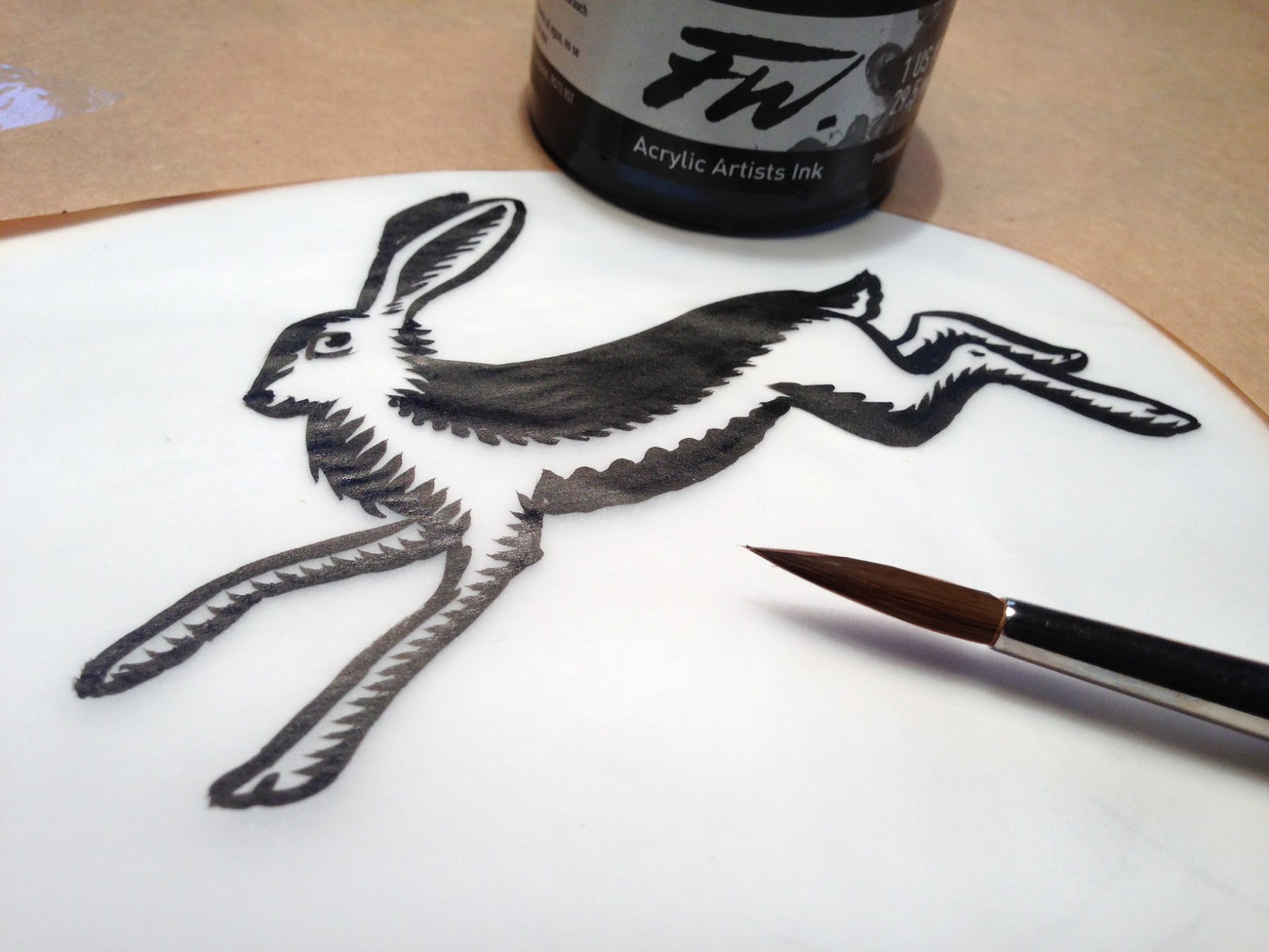
Work-in-progress ‘Hare’

‘Hare’  © Peter Gander 2013
Another work-in-progress shot, this time of 'Hare'. (The curved brown paper surrounding it is greaseproof which protects the detail paper from picking up grease marks from my hands, which would resist the water-based ink and cause patches). Will post the final card mock-up tomorrow. Ink & brush.

‘Fox’ card image

Rough brush and ink sketch for ‘Fox’  © Peter Gander 2013

Card mock-up for ‘Fox’  © Peter Gander 2013
The latest in our ‘Menagerie’ line of handprinted cards. ‘Fox’ will be made into a rubber stamp and each one will be handprinted onto individual cards. Original: Brush and ink.

Wednesday, February 06, 2013

Monday, July 09, 2012

Wall design idea for ‘The Beaney’, Canterbury


My mock-up of the design in-situ
The original 19th C High Street, Canterbury entrance to The Beaney.
So now you know!  © Peter Gander (after Chaucer!)
Details from the artwork  © Peter Gander 2012

The new bit of The Beaney to the rear, (the artwork would appear bottom left, full width of the stairs)


My rough sketch indicating the final idea - ‘The A to Z of the B and C’  © Peter Gander 2012
 
Canterbury City Council (CCC) recently asked local artists to submit their ideas for an artwork to coincide with The Beaney’s re-opening after redevelopment. The Beaney (formerly The Beaney Institute) is a museum, art gallery and community library/cultural centre.  The winning artists’ work will appear in the new wing which has been developed to the rear of the main 19th century building’s entrance. Occupying a lovely airy space above the entrance stairs, it measures 1.5m x 10m so it’s a great opportunity and one I particularly relish as I went to art college in Canterbury and it would be a fabulous opportunity and honour to have my work exhibited in such a great venue as The Beaney so I wait with bated breath for the council’s decision.

THE IDEA
The concept is that whilst the area is huge and people are just arriving, leaving or looking across form the nearby mezzanine and perhaps can’t take the whole thing in at once, they can take a bite-sized fact away with them. This sits in line with the spirit of the place in imparting information in an interesting fashion. ‘The A to Z of the B and C’ provides an amusing alphabet of Beaney and Canterbury (the ‘B & C’ bit) tidbits such as the connection between ‘Canter’ and ‘Canterbury’ in a palatable way. I chose the new Beaney identity’s purple colour to add a simple two colour effect to the drawings, with a tint of the same, ensuring the piece wasn’t visually busy. A simple papercut-style floral trail snakes through the work, adding a ‘journey-like’ element to the work. I didn’t address every letter of the alphabet, it was merely a sketchy indicaton of my main idea, the intention being, should I win the work, that I will work alongside The Beaney to complete the piece. It will be reproduced digitally and exhibited on a large roller-blind-like ‘canvas’. The whole thing will be hand-drawn, of course. And hand-lettered.


Wednesday, May 09, 2012

The real McCoy tea towels


As an artist sometimes you can’t beat the real thing and taking collection of your tangible design wafting around in big style on a cloth canvas is SO much better than the piece of paper you were looking at for months on end. Such is the case with our set of 5 (Jubilee to come) tea towels taken in last night. The colours were bang-on and the quality of the cotton excellent. We’ve also made them look trendy by hanging them on our magnolia tree. Hopefully you can’t see it’s spitting with rain. Well, it IS May in the UK. Buy ’em on Folksy

Friday, May 04, 2012

Wednesday, May 02, 2012

Great Britain’s Great bag design

Great Britain’s Great bag design  © Peter Gander 2012
Continuing the patriotic flavour and fervour, this is our single-colour Royal blue Have a Gander bag design for 2012. Hand-drawn illustrations with dip-pen and ink and hand-lettering. Digital colour.