Showing posts with label bird. Show all posts

Sunday, December 27, 2015

Fiona’s Flamingo hand-painted wooden wall art


I always endeavour to make a handcrafted gift for my wife Fiona for Christmas and this year I opted for a flamingo, a bird which she is fond of. Discovering an old and rather naive version of one set against the sea, I was taken by the idea of putting our local landmark Herne Bay pier head on the horizon. The engraving flamingo had a rather woeful-looking neck, so I gave it a more graceful curve, which also a better fit to my tall format and I was not giving much attention to reality, so this bird has an exaggerated neck.
.
My inspiration, an old coloured engraving, showing my grid and adapted neck to fit a taller format.
The oldest draughting trick there is: drawing a grid to translate the image  onto a larger format.
As long as your grid’s reliable, you can draw any squares in (note mine are numbered like a Battleships game) so you can re-visit undrawn areas...

Ensuring that the width of the neck is graceful and ‘S’-like.

Tracing the 2nd side before rubbing down
Positioning the trace down. To make this easier, the trace matches the size of the plank of wood
The trace taped on to transfer down
The darker line shows where the trace is complete. Sometimes a contrasty colour, like a red biro works well for this.

I liked the original caption, so traced that down too

A bottle of local craft beer helps burn the midnight candle!


Base colour for the pink in light acrylic
Blending in a rose madder pink
Base colour complete (note top of plank is yet to be trimmed off square, but acts as a useful trial area for colours


Loosely dashing in lighter ling leg segments

Loose is my style, so adding the sea in sketchy curls
Coming together
Prior to the ‘staining’, the colours looked a tad brash...
Adding an engraving-style scratch pen line in black ‘tightens up’ the image
Looking good with the caption hand-drawn in ink, prior to putting the coffee on!
Yes, really using my favourite black espresso coffee to add a sepia-coloured patina
A petit gris brush lays down the coffee
Head close-up showing the still-wet coffee lying on top of the original whitewash base

Local icon ‘Herne Bay pier head’
After staining, I bevelled the edges with a plane (sides) and surform (ends)
The final piece.

Monday, September 09, 2013

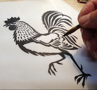
Inked ‘Cockerel’

The final illustration  © Peter Gander 2013


A new www.haveagander.biz addition to the ‘Menagerie’ series of hand-painted animals which we make into rubber stamps and hand-print onto greetings cards.

Tuesday, May 07, 2013

‘Thank You’ swallow gift tag art

Swallow Thank You’ tag  © Peter Gander 2013
Today I adapted the artwork of our ‘Swallow’ card www.notonthehighstreet.com/haveagander/product/hand-printed-swallow-card to customise it for a ‘Thank You’ gift tag & card. Original: The swallow image and new banner were hand-drawn in black ink with a brush and scratch (dip) pen.


Drawing the new banner with scratch pen  © Peter Gander 2013

© Peter Gander 2013

Tuesday, February 19, 2013

‘Goose’ brush and ink

‘Goose’ brush and ink  © Peter Gander 2013

Card mock-up  © Peter Gander 2013
This is the final number 10 in a series and what more fitting beast for our Have a Gander ‘Menagerie’ range of handprinted cards than a goose? Available on Folksy and Etsy soon. Original: Brush and ink.

Monday, February 18, 2013

‘Owl’ brush and ink

Owl art  © Peter Gander 2013

Mocked-up card  © Peter Gander 2013
The latest in our long line of ‘Menagerie’ handprinted cards. This one’s an Owl, a British Tawny Owl, to be precise. Original: painted in brush and ink.

Saturday, February 16, 2013

‘Hen’, brush & ink

‘Hen’  © Peter Gander 2013

‘Hen’ card mock-up  © Peter Gander 2013
I’ve been ‘hen’tertaining myself with more beasts for our hand-printed ‘Menagerie’ collection. This ‘hen’some bird is of the speckled variety, inspired by a favourite beer, no doubt. (Original: hand-painted by brush & ink).

Monday, February 04, 2013

Inking ‘Swallow’

Inking the Swallow  © Peter Gander
 A 'bird's eye view' of a work-in-progress shot inking the Swallow, one of a set of new Have a Gander 'Animals' Greeting Card images. The painted image is destined for the rubber stamp maker. Once it's turned into a stamp, we'll individually hand-print them onto blank cards. All a very painstaking process, but the result is a beautifully-handcrafted card with a very special quality worth all the effort.

Thursday, January 27, 2011

Work-in-progress: The Crow King (vinyl & board print)

Continuing my corvid phase, today I used a lino-like material called Japanese Soft Cut vinyl that I bought online from Intaglio Printmaker.co.uk It’s floppier and shinier and softer than lino, though I think lino still has some way to go to be beaten. The vinyl I found much ‘stickier’ than lino, with the end of the cutting stroke often rebounding or not finishing in a clean manner. However, if you are not planning anything too fine in detail, it’s lovely stuff and very easy to carve.
Carving fine lines is tricky with vinyl
The pencil ‘rubbing’ to check progress
Mixing a two-colour gradation on the roller
Ready to roll. Note the card registration blocks at the top
The first ones drying
Inking the card background
Once my design is carved, I make a ‘lino rubbing’, placing a sheet of thin cartridge paper over the lino/vinyl to check that all is well with the image. Then I cut out the shape with a craft knife (easier to do than with lino) and stick it onto a board to keep it stable for printing and to register it properly. Rather than use a solo black for the crow, which after all, have irridescent feathers, I opted to mix a blue and black gradation on the roller. Then it’s just a case of testing the roller pressure and away I go. I tend to try out different paper colours as artists prints (AP’s) until I find my preferred one. In this case it was a humble brown paper. On to the background. Sometimes the background simply doesn’t warrant the efforts of lino/vinyl cutting or I simply prefer to use a different substrate for its unique texture. As was the case here - I cut out the negative area left by the crow from card, the kind you find on the back of layout and cartridge pads. It’s not as soft or corrugated like cardboard and being made of pulp, reveals interesting textures when inked up, not a dull smoothness. Use shellac or PVA to prevent the inks from seeping too much into the absorbent card though. Once this has dried and the cut-out married up to another board and registered, make the second colour print-run. The main photo reveals the final print, which I am very happy with! Seawhite (of Brighton) waterbased printing inks on (Paperchase) recycled ribbed brown Kraft paper (A4: 297mm w x 210mm h).

Wednesday, January 26, 2011

Crow II monoprint

Crow II monoprint © Peter Gander
Another monoprint study. This is essentially a sketch for a two-colour linocut that I plan to cut later tonight.

Tuesday, January 25, 2011

Crow I (adapted monoprint)

Crow I © Peter Gander
I confess I tried hand-colouring this black-only monoprint but sadly I made a hash of it. Thus with a bit of Photoshop magic, I saved the piece, though now that it has been digitally enhanced, I can sadly no longer say it is a monoprint, of course. But the 1940’s-style colouring looks good. Original: water-based ink on Neutral Daler-Rowney Murano Pastel 160gsm paper.

Tuesday, November 17, 2009

Black as the Night (crow) 091117

Black as the Night Crow © Peter Gander
Did this during lunchtime at work. Drawn in white Conté Pastel pencil, or rather, not drawn, as everything but the crow is drawn of course! On Daler-Rowney black sketchbook. The smaller crows were ticked in afterwards with a black Conté pastel pencil. With my new passion for relief printmaking, I see a strong future for this kind of image with its strong design and mono appeal.

Illustration for upcoming 'Lake District Map'

Hand-drawn in brush pen with digital colour.  © Peter Gander